Wednesday, September 24, 2025

Depth of Field


 1.A (The Godfather, 1972) Everything is kept sharp for us to see Micheal learn while the family is conducting business, this foreshadows him being the new don.


1.B (The Joker, 2019) The shallow focus shows that Arthur is isolated, it also shows how unstable his mental state is. Foreshadowing his transformation into the joker.


1.C (Up, 2009) This scene from up conveys the blur of the whole frame showing its nostalgia and warmth, enforcing the bond with Ellie. 


2.A Deep focus in this still is used to show all the detail and everyone around it. Used to make viewers see the whole farm for details.


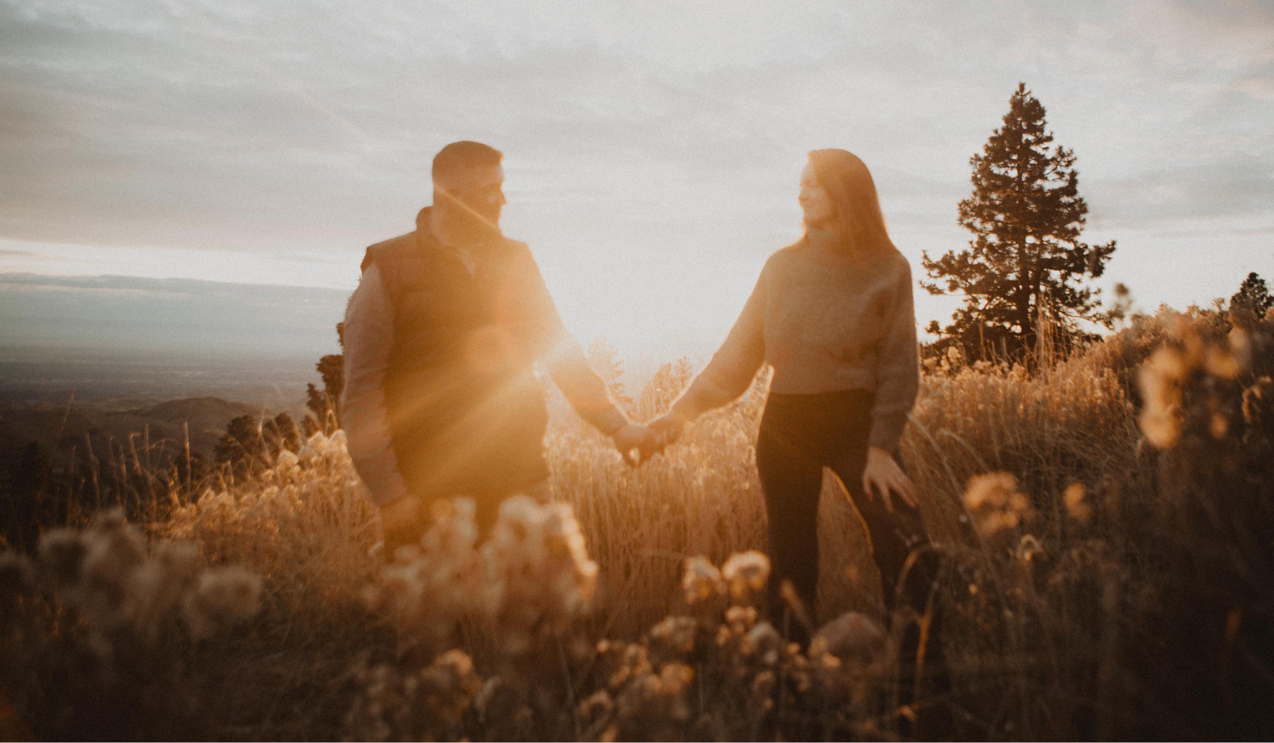
2.B The shallow focus is on the people on the bottom of the still. This shows how it separates the bottom people from the others in the background.


2.C The soft focus shows the still is blurry due to the setting. The whole environment is shown to be how isolated the building Infront is due to the trees.


3. The challenge of using shallow focus where I put a sharp bottom against a blurred background, it was harder due to depth of field. The lighting helped by making the sharp part of the still darker when the blur came from the brightest of the still. I was going for isolation based on the people on the bottom to separate from the top of the still. Next, I took a sharp still at a strawberry field. I made the still sharp in order for viewers to see every detail that it had to offer. I felt like an almost like landscape still would fit the best when it comes to a sharp shot still. I learned that the point of a sharp shot is to label details for viewers to see mostly used in a long shot. With my still, it shows the setting including people that would fit only for sharp shots only. Now, using soft focus I went for how I used the building as it being isolated by the trees. First of all, having a blurry still was made by simply putting water on the camera making a blur in the camera. In the still I showed a picture of the executive building under construction, I took a picture with the building in between in order to create an isolated feeling. Even if its blurred, details are still noticeable like the bald eagle statute that is on the right side overlapping the tree. Using this blur you can see how obvious detail is still being shown but the smaller noticeable details are harder to see due to the blur. In conclusion, I learn how all three shots depending on using blur can have meaning behind the subject being shown. I felt like I showed what the effects the blurs have on the still conveying its meaning of the selected still.


Friday, September 19, 2025

Camera position

 1.A (A Bug's Life, 1998) This still uses a low angle on Hopper to describe that he is superior. The still also uses the light from the top to shine down symbolizing that he is almost God-like.


1.B (Toy Story 3, 2010) The Still shows a slightly canted level shot going to the light. This makes it mean that something wrong is about that light.


1.C (Monster University, 2013) This still uses height to put the camera point of view showing both the main characters. This height shows that they both have power over those around them even if they are different from others.


1.D (Finding Nemo, 2003) This still shows distance to symbolize the long shot of a crowd of fish in a net, including the size of Marlin which shows the sheer situation size that he's in currently.


2.A This still uses a low angle on the dragon to make it have a sense of dominance and make it look bigger than usual.

2.B This uses level to correctly align the camera with the focus of the picture which is the giraffe. It levels with its eyes 

2.C This uses a shoulder height to capture the facial features of the character more closely.

2.D This uses distance to make the character in a medium shot which captures half the body, to capture what items are around them.


3. The challenges to face were harder to see which ones had taken effect than others. For example, the difference between height and level were difficult to differ. I used level to horizontally align the eyes of the animal with the camera's position. Height was used to show the character until the bottom of the shoulder which shows a shoulder shot. At the same time, it can be confused with a level shot because it aligns the eyes with the camera. The shoulder shot should make it where height is shown more than level. The angle shot was easier than expected since the focus is tilting the camera up or down to the character, I feel like the still does capture the low angle of the dragon to make it look bigger than if it was taken without angle. I feel that this is the easiest element to understand than all others because angle is a noticeable feature in a still, while others are harder to see. Using distance was very confusing, you have to capture a shot from a certain distance and see if any other element is also used that could replace distance. The still would show height but the distance of the still would replace it as a medium shot. These stills were a challenge to discuss of which element was used, I feel like height and level is still very confusing of the difference between the two to really know which takes over which. I feel that these stills do represent its correct element needed.


Thursday, September 11, 2025

Balancing Mise en scene


1.A (Parasite, November 8, 2019) This scene contrast shows a yellow dull setting showing that this scene is taken a poor setting. The contrast gets the viewer to look through the windows to see the matching color scene.


1.B (The Incredibles, November 4, 2004) This scene shows the setting being plain gray symbolizing that this setting has no life, while Ms. Incredible has a red suit on symbolizing that she is the only one with life and it attracts the viewer to the brighter more vibrant color even if it's small in frame.


1.C (Star Wars: Episode IV - A New Hope, May 25, 1977) This scene shows a starship that takes the whole top side of the still. This scene uses size to catch the viewer's attention to the starship that is the biggest object in the frame.


1.D (The Grand Budapest Hotel, March 28, 2014) This scene shows the frontality of the character. The viewer's attention will be on the person in the middle instead of looking at the bellboy or the background.


2.A This setting shows the white building with a red car in front, putting the viewer's attention on the red car. Using contrast we can guide the viewers attention.


2.B Using color we can guide the viewer's attention to the red cars even if the other two cars are in frame. The others being white blends in with the white building in the background. This means that the red car is more noticeable than the others.

2.C This still represents the different sizes of both objects. Using size can grab the viewer to look at the larger building instead of the car.


2.D Frontality shows the character in front of the camera. The blue car is in front of the camera, getting the frontality. The viewer would see the blue car first based on this.


3. Taking these still shots were giving slightly a challenge. The shot using contrast was very confusing due to the fact that having a white building behind a red car on a red floor. The contrast was harder to learn and take a shot to actually notice that contrast is taking over the scene to guide the attention of the viewer. Using color for the still shot used more objects that were the same color of the building. Color and contrast are different but sometimes can be confused for each other. I put more objects that had the same color to show that the red car is the only one that isn't white and should be the one that viewer's look at first. The using size, I put a car of the same color of the building, I did this because if I put any other color than the building's color, then that would count as more towards color instead of size. I made sure to put the building in the vertical hot spot so that viewers would see the big building first instead of the car. Frontality was basically putting a character in front of the camera. I put a different colored car than the others which can indicate color but the frontality of the car is guiding more eyes on it instead for the reason of color. The color also receives a clear view instead of the other cars in the back that the blur of the camera puts them more out of focus. I feel good about all results and that more improvements could have been made with the possible setting, such as the red floor.


Thursday, September 4, 2025

Rule of Thirds

1. The Lion King (1994)


2.A. This picture shows how the trees are everywhere which makes the rule of thirds not work.

2.B. This photo shows how the cruises are in the hot spots of the rules of thirds 


3.A. Animal is shown across the whole picture meaning that the rule of thirds isn't applied

3.B. Animal gets all hot spots showing the face in the middle which used rule of thirds


4.A. This picture shows that the hot spots of the rule of thirds is not being used.


4.B. Vertical lines of the rule of thirds show the two animals.

4.C. This photo shows a couple that both look at each other with the top hot spots at their heads. Showing a sign of trust and love.

4.D. This picture shows the vertical line and top hot spots of the rule of thirds while both characters are looking away giving a sign of disagreement, with also the amount of space meaning seperation.


5.A. In the iconic scene from the lion king where young Simba looks out at the vast savannah with his father Mufasa, the filmmaker shows the rule of thirds. By placing Simba and Mufasa on the left vertical third of the frame, they emphasized not only the bond between father and son but also of the world around them. The remaining two thirds of the frame showcase the large savannah, highlighting Simba's smallness in comparison. This scene conveys the themes of growth, responsibility, and the weight of the kingdom that Simba will one day have to rule himself. Making it a truly powerful and memorable moment in the film.

5.B. I chose this picture because it represents the attraction of two people. When using rule of thirds for the picture. Their heads lie in the top hot spots of the board. They look at each other which tells us that they have a feeling for each other. By using rule of thirds, the amount of space they have is close enough to say that they have a relationship with each other. Another detail about this picture is that the sun mostly separates the couple apart meaning that the scene is happy because the sun represents happiness. In the middle as well, they both hold hands to represent that nothing can separate them, even the sun in the middle. The setting around the couple takes place in a field during sunset or sunrise, which is a staple for what people think as a "happy place". The whole picture's story tells us that these two will always be there for each other and that separation is less likely to happen.


Final Cut